Back to Projects
Speed Spare Branding

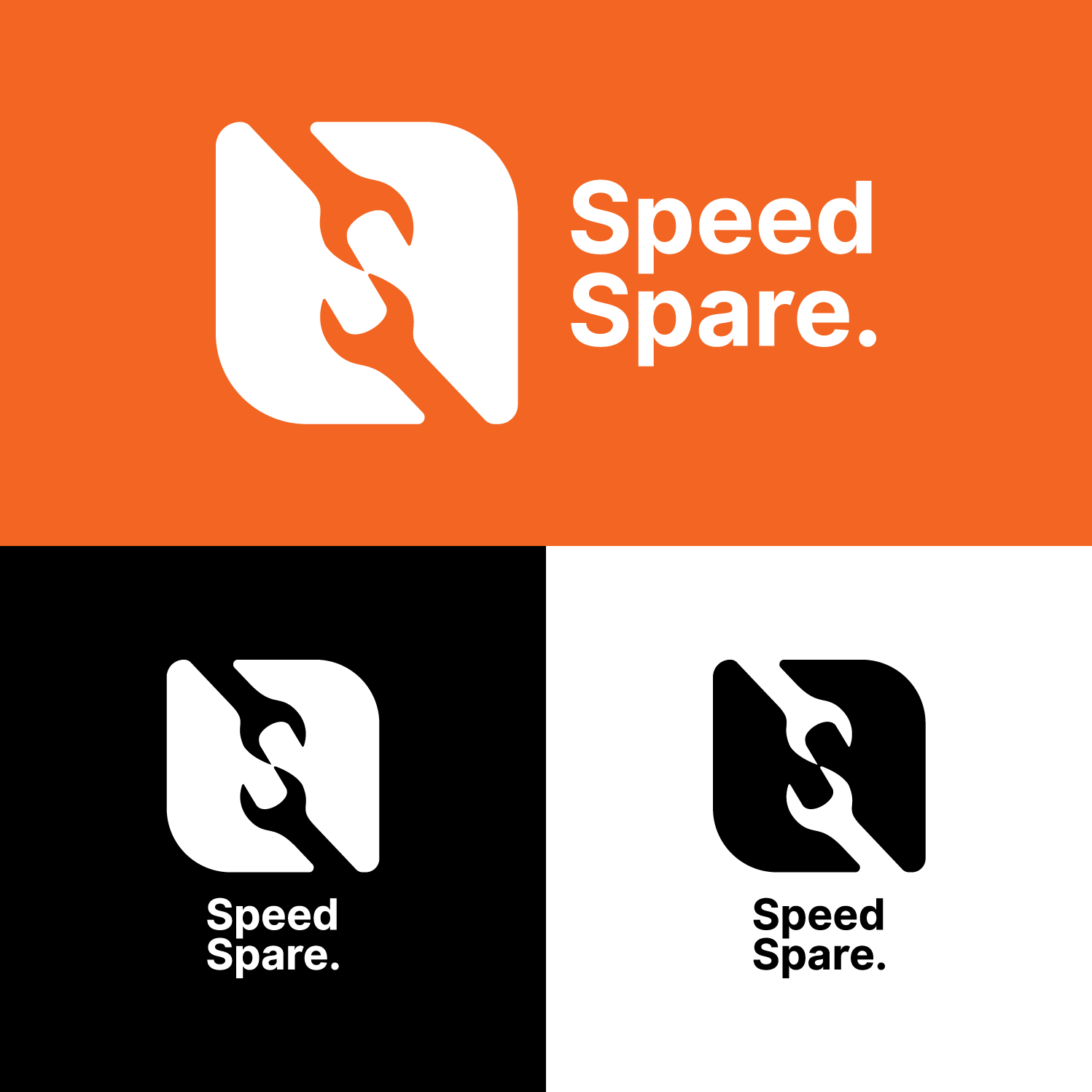
Speed Spare is a fast, reliability-driven brand—designed to move with precision, clarity, and confidence. Built around smart logistics and bold visual identity, it delivers essential spare parts quickly while creating a seamless, modern experience for today’s customers.
Speed-Spare Image
Scope of Work
Brand Identity Design
Delivery Branding
Digital Presence & Visual Assets
Challenges Speed Spare entered a fast-moving, utility-driven market where most brands rely on generic visuals and low brand recall. With no established identity, the challenge was to build trust quickly while standing out in a space dominated by function-first, visually inconsistent competitors. The brand needed to communicate speed, reliability, and precision—without feeling dated or purely mechanical.
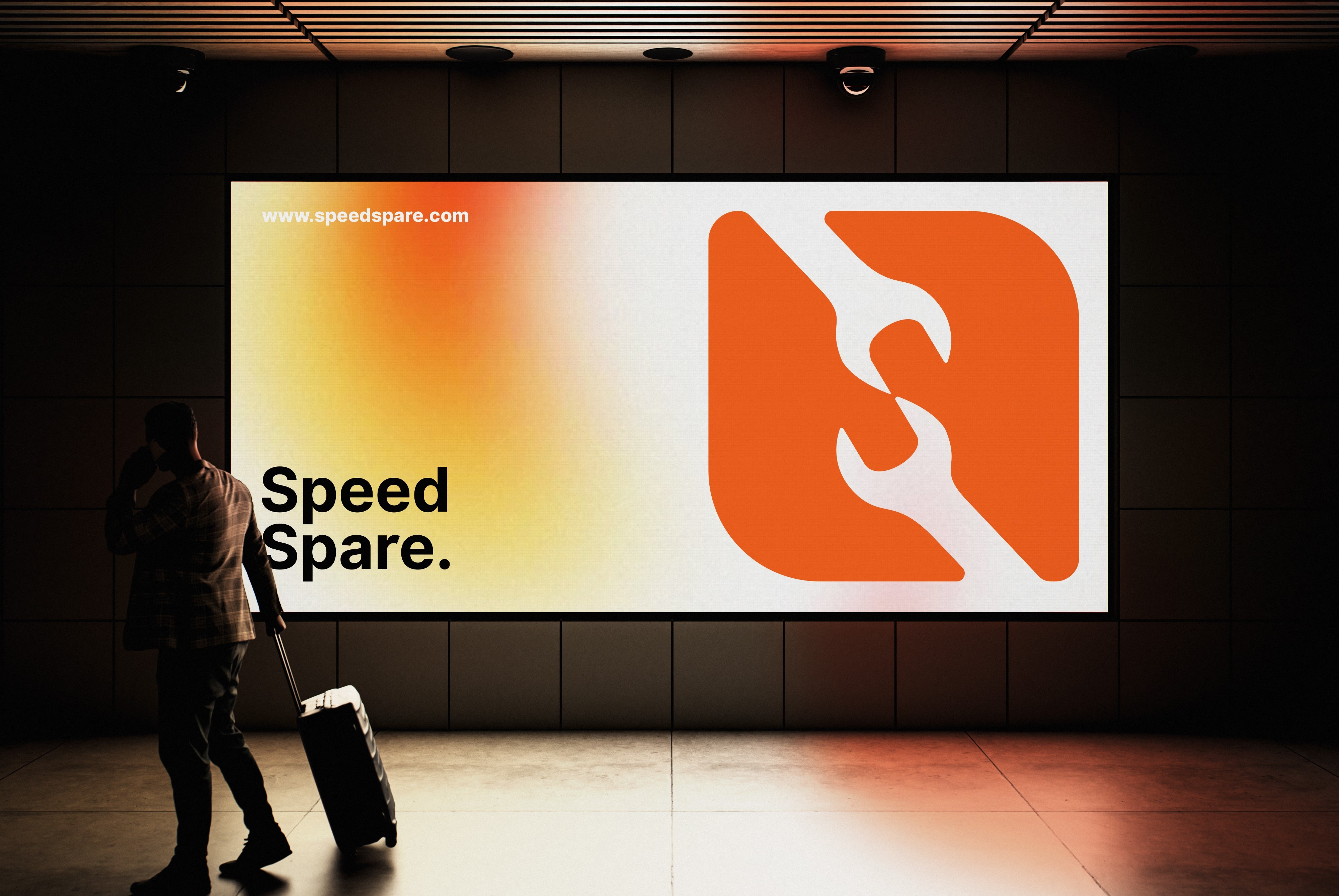
The Solution We crafted Speed Spare as a bold, modern brand rooted in motion and clarity. Starting with a strong visual identity, the logo and design system were built to reflect speed, efficiency, and dependability. This foundation extended seamlessly across packaging, delivery branding, and digital assets—ensuring consistency at every customer touchpoint. A motion-driven logo concept further reinforced the brand story, bringing Speed Spare to life with energy and purpose across both physical and digital experiences.
Speed-Spare Image Speed-Spare Image
Typography Typography plays a crucial role in shaping Speed Spare’s voice. We chose Inter for its modern geometry, excellent readability, and versatility across screen sizes. Its clean structure supports a functional, no-nonsense tone while allowing flexibility through multiple weights—from lightweight informational text to bold, high-impact headlines. This system ensures consistency, accessibility, and clarity across digital platforms, print materials, and motion graphics.
Colours Speed Spare’s color palette was designed to communicate speed, reliability, and confidence at first glance. The bold primary orange acts as a visual accelerator—symbolizing motion, energy, and urgency—while anchoring the brand strongly across digital and physical touchpoints. Neutral black and white provide contrast and balance, ensuring clarity, legibility, and a modern, functional feel across interfaces, packaging, and branding assets.